Monday, April 20, 2009

class exercise 2!


i almost forgot to post this!
here's our class exercise which we did in a group of 3 and we were supposed to use basic shapes and lines etc, to bring out the idea behind two words (we had a choice from many) so here's ours, "crash" and "power" respectively.


Friday, March 20, 2009

our final project

i won't attach the final project here because its simply too much, but i would just like to highlight certain lessons learnt from this group project that i've gathered across the few weeks i've worked on this storybook.

1) i think that i've learnt that having contacts is a very important thing, it really helped that one of the group members had an ex-neighbour that is in the printing business and it made working with the printer much easier.

2) i think that having to be able to work around the different technical limitations is sometimes so difficult it may lead to a lot of conflict. for instance, we had one group member who did not have adobe illustrator, this caused a lot of vexation and hassle for all of us.

3) sometimes i wonder if giving a fair allocation of jobs is better than actually giving an uneven workload and getting things done faster and better. and it seems extra difficult in terms of design, where each group member is so differently skilled in different areas.

4) and lastly, children's storybooks are indeed NOT EASY to publish!

tutorial 6: our hardest assignment yet!


i think when everyone got to class for tutorial, there was a resounding groan of "man, this is our toughest assignment yet!" and i have to agree. i took more than two nights to do my postcard and the different colour scheme got me bonkers by the end of it.

ms siti was suggesting that my original and chosen colour scheme was in fact not the best colour scheme there was. we spent a while trying to determine it and i decided to go with the attached. ms siti also recommended i add more stuff to the postcard otherwise it might look a bit sparse and this is what i did... it doesn't look like much difference but it is something different at least...

assignment 5: aiyohhh asia!!

when we were given this assignment i almost immediately thought of food and making a postcard about the different kinds of food that asia has to offer people. but learning from the lesson of the water cooler (see assignment 2), i stopped myself in my tracks and decided to rethink the idea. and so i went on to another idea, which is a mass (and mess) of a kid's drawings of the different landmarks in asia, the things that stand out about asia. i kind of put myself back in the day when i was a primary school kid and had an art assignment to do. that was the kind of feel i wanted to achieve.

i started by googling for various images of prominent landmarks like the great wall of china, the merlion, the petronas towers, and then food and other items that were very uniquely asian. i traced those images and combined all the CG sketches onto one clipboard and coloured it. heres how it looked...


tutorial 5: is your poster effective?

some points about my poster brought up during the tutorial was

1) not everyone has dreams of performing, (which is settled by the idea of having different ideas for the campaign)
2) the heading fonts were too playful (i chose them, with the intention of being menacing actually, but i guess i need to go find better fonts! d= )
3) they really liked the glow effect that the tagline had.
4) and my logo's too small!

so here's the poster after incorporating changes!

assignment 4: what do i do for my poster?!


when jing mentioned we could only use our own photos for our posters, the idea of doing a shoot for a poster about dreams came to mind. here's the story board to explain what i mean.

and so i ask a friend for help with taking photos, he had an awesome DSLR and i couldn't find anyone to model for it, so i had to model. haha.

here are some of the photos i really liked...


i chose the third picture cause i felt it conveyed the message well, it seemed like a sad picture - after all having your dreams robbed is something that sad. and here's the poster...


the colours white black and red were chosen cause they essentially contrasted each other well, and would bring a lot of attention to the poster while people are walking by bus stops and such (where the posters are intended to be put) and yea, the rest of the poster was quite straightforward (= except for the part when i had to try and conceal certain areas of the background which had imperfections in them.

it occurred to me while doing the poster, that not everyone has the same dreams as me. the poster generally encourages people to not stop dreaming and hence it had a picture of me singing...

so i was thinking that it probably should, in the case of the "initiative" have a number of poster designs, for different occupations and different dreams.

tutorial 4: story-telling

i immensely enjoyed this week's tutorial, just to see everyone's own stories, and how they came up with them, their twist(s) and what not. love it!

anyways for my photo story, i think it was quite good that people could get what i was trying to convey, just design wise, the background colour needs to be changed, and the arrows didn't really do their job, it was rather confusing
and the arrangement of the photos needs to be tweaked...

i tried a number of things and when jing announced that it can be on 2 separate pieces of a3 i was elated. so here it is...

assignment 3: a picture paints a thousand words


i could not think of an idea for the photo story until a few days before i had to present it.
i swear, the toilet/shower is the best place for inspiration. thank god.

anyways. here's the storyboard of what i intend to tell through photos,


the setting's school, basically, and i was hopping to be able to portray the main protagonist as studying, with the junk food and the books. with the pieces of paper strewn over the floor i wanted it to seem like he was rushing a paper or something by a deadline, cause there was a calender close-up shot too. but it turns out, he's actually writing a love letter! (=

so here's the actual thing i will be presenting at tutorial...

tutorial 3: processes of abstraction


at tutorial, to my horror, 2 other classmates did a pictogram of a water cooler! and what's worse i heard a lot of people from the other classes did the same!

that aside, ms siti suggested that i simplify the plug and pipe from the 1st stage of my abstraction process and add it to the 2nd stage as well. thanks siti! she also really like the grey line showing the abstraction process.

so here's the finished product, in preparation for my portrait-oriented portfolio, but i still think i need to work on it more...

assignment 2: of abstracts and prototypes


so, following the water cooler idea that i was rather pleased with, i went around school taking pictures of the various types of water coolers we have around. and found two most common.

and here's the degree of abstraction.
i had a lot of difficulty doing a 3D pictogram for the first stage and so i went straight to 2D. i'm just worried that the simplification or abstraction, rather, was too little for each stage! but that was really the best i could do - i hope tutorial would help give me some ideas...

lecture 4: pictograms

i think the lesson learnt from the lecture is that pictograms are abstract. as simple and obvious as that sounds quite duh that a pictogram needs to be abstract but its not as simple as it sounds. it needs to not be entirely like what it signifies yet it needs to have some form or relation to it.

our assignment is to create a pictogram that can be used in nus. and it struck me immediately to do something about water coolers, since we have so many of them yet no one really knows where they are! i was rather pleased with myself d=

tutorial 2: me, myself and i computerized!

i don't really like it when i don't know if what i did was good or bad.
haha i presented my work at tutorial right, and well people generally... didn't have anything to say about it! i was about to ask, "so... is it good or bad?" haha.

i guess it was generally positive sentiments about my presented work, but i'm not sure.

thankfully siti said something about the background and how the mostly white background would be really draining in terms of the colours i use for the name design.

so i was thinking about how to improve the background when a classmate gave me this link to a tutorial online about making curtains that look real.
http://www.vectordiary.com/illustrator/illustrator-tutorial-realistic-curtain/
thanks to the folks at vectordiary.com, my fancy namecard now
looks like this (=
i like the curtains a lot!!! i also resized the letters so that they look about the same size and the disparity wouldn't be all the great. i also reduced the opacity of the lights so they look more realistic!

assignment 1b: computerizing my design...


i had to do my CG namecard in between rehearsals for my dance concert at UCC. phew. not easy. i actually learnt how to use the vector tool! which i'm really happy about.

in thinking about that colours to use for the stage curtains (which form the background of my chosen rough), i intentionally did not want it to grab attention from name design, and i felt that red (whether dark or not) would actually be quite a striking colour. and i remember that back in primary school, my stage curtains were a dark blue... so i decided to use them.

i think the general idea behind the design is mainly using the colours that those objects would ordinarily be in. only exceptions are the dancer and the music notes cause they risk blending into the dark background, so the colours chosen were to contrast it against the background. yup.

so here's the piece i'm going to present for tutorial

Wednesday, February 25, 2009

lecture 3: CG

i think the learning point from this lecture wasn't about computer graphics actually, cause i felt that whole segment was really... overwhelming... so much to know about computer graphics! yikes.

but what i learnt from jing most was that i should stick to my idea, and not keep changing, after i've decided upon it. it wastes a lot of time, energy and brain power trying to make something work then changing idea all over again. yep (=

tutorial 1: me, myself and i

so i was at tutorial for the first time and everyone presented their work... i thought that everyone's ideas were quite original! quite impressed (=

i presented my thumbs and roughs and mentioned that i was either going for the beach idea or the performer idea and a classmate, michelle said something like "everyone likes going to the beach, but not everyone can do what you do" that kind of reinforced that notion that i chose the right idea *grins*.

other than that there wasn't much feedback - i think everyone just needs to see how our ideas look like when we convert the drawing to CG!

i think i'm glad i didn't choose the beach idea, had i done that i probably would have a hard time trying to do the sand - i have no idea how to do it!

assignment 1a: putting ideas on paper

hmmm. i was waiting for a friend so i decided to whip out a pencil and my notepad... and i liked how the ideas came up! here they are:
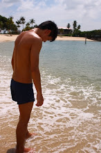
i was meeting my friend to go hang out at the beach so this was one of my first ideas. i really like it, cause i can picture it in my head, the blues and the browns for the water and sand... and the beach is something i really like too so yea!


the next idea actually is my favourite. i like to sing, dance, act and i like music, so i decided to incorporate it into my name for one idea... this is really what i had in mind right at the beginning when jing introduced the assignment to us. i like the letter 'E' and how its formed by a couple of piano keys! (=


the next two i really just came up with the make numbers (we needed a minimum of four ideas! haha. the first of the following is mainly cause i have an interest in astronomy - i really liked it as a child, but it never really followed me as i grew older. and the next idea's quite crappy. i'm a people-person, so i have all sorts of people around my name. haha. *shrug*


and so i decided to work on the second performer idea i had... here are the roughs.

lecture 2: the design process

i like how jing tied in the creativity machine from last week into the design process.
her creativity machine, she said, was something like a number of some peoples' you take some ingredients and your put them into something, and the product comes out. which is sorta like the design process.

i think what really dawned on me from the lecture is that you need to do a fair amount of research before you design. i always thought people just had strokes of genius and brilliance and bam they come out with whatever they need to.

and we got our first assignment today, we have to design our names in forms that reflect our interest. off the top of my head i thought of something to do with music and/or the arts. that's what i really love anyway... maybe i'll do that... (=

lecture 1: introduction to visual communication


i was rather apprehensive approaching this module because firstly i've never thought i had any 'design sense' or what it took to be creative. i can't draw, i can't use adobe photoshop - i'm worried i might actually do quite badly! i decided to approach 2208 bravely nonetheless and "do the best with what i have" - which is how life's meant to be lived anyway (=

back to our first lecture, it was looking quite good and it seemed like the module was quite manageable. one major learning point i took from it was that design and visual comm is firstly communication. it is "communication through the use of visual aids" like jing said. what occurred to me is that it's basically the same as normal, written or verbal communication. the main notion is the message. it is how you encode your message so that someone else may receive and understand it. in every type of communication your message has to be strong and clear. the things we were to learn about were simply aids and tools through which this message is to be communicated: typography, composition, colour theory...

when jing started showing us the different portfolios our predecessors made, however. that's when i really really got discouraged. some of them were SO brilliantly done! it made me question why i even was doing 2208... because it felt like i would never the ability to do as well as them. )=

that aside, we were tasked to do a class exercise at the end of lecture and we were to design a "creativity machine" that when used, increases our creativity a hundredfold.... and here's my interpretation of it!
my creative machine

it's by apple, definitely d= and the machine comes with a cool headpiece as well as a companion pen! the pen and headgear both have an element (some form of a nonperishable gas) that stimulates the creative side of the brain and allows it to function much better, without hindrance and also without side effects! (= of course like every other mac, it can be connected to an imac or a macbook to be fully customizable!

blog (learning journal) requirements

it should address the module's learning objectives and should clearly document (for every assignment, classroom activity and project) following issues in an on-going fashion
- efforts in researching and developing concepts
- thought process and decisions while dealing with design problems
- efforts involved in production
- knowledge gained and applied
- peer feedback and your reflection on peer feedback
- self-assessment

the learning objectives of nm2208

  1. to learn basic principles of information design, methodology, and digital image creation
  2. understand the functions of visuals in communication
  3. learn the techniques and methodologies for solving information communication problems
  4. develop visualization skills, concepts and techniques
  5. understand the relevant concepts in the psychology of perception, cognition and their relation to visual design and layout

Wednesday, February 4, 2009